Pretty Mail Inside - Mixing Color Families + Altenew SALE
Good Morning!
It's no secret I love pastels and soft colors, but I also adore bold, bright hues, and at times, a more muted palette. The thing I really struggle with, is mixing them all! So today's card is all about that and a couple of little tips I've picked up along the way in making different color families come together.
Altenew SALE
Before we get to the card, I wanted to share that this sweet stamp set is currently a part of a huge sale on SB.com - most Altenew stamps and dies are 20% off or more, meaning this gorgeous (and really large) stamp set is under $18!
You can use my link here or use the link provided in the supplies list below. The sale is valid until midnight Thursday, September 20th! Happy Shopping!
***
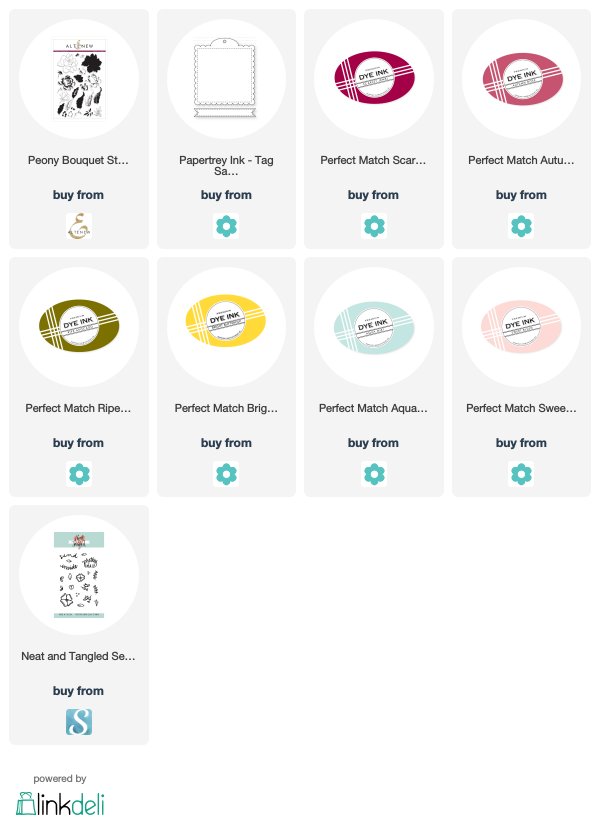
To start today's card, I used PTI's Tag Sale Quilted die to cut out the scalloped tag. I used Altenew's gorgeous Peony Bouquet stamps for all of the floral stamping. I love that this set combines outline, fill and shading options for each flower. It makes it so versatile to work with.
For the sentiment, I used Neat and Tangled's Pretty Mail set.
To pick my colors, I started with a pastel palette of Sweet Blush and Aqua Mist, and then took a swift departure from the usual, by adding in Ripe Avocado for the greens, Bright Buttercup for the yellow, and a mix of Scarlet Jewel and Autumn Rose. Here are a couple of tips I discovered along the way while playing with color.
Color Groupings
As far as I can tell, it really helps to have a grouping of each set of colors. Meaning, at least a couple (or a few!) pastels, and same goes for the muted tones. It makes the color choice seem deliberate and harmoniously blends all the shades together.
Harmonious Color Palettes
I also found that picking a harmonious color palette goes a long way.
For example, had I decided to swap the soft pink for a muted pink, and the soft aqua for a muted aqua, these colors would look great. But swapping out a couple of the colors (pink and aqua) for pastels, really adds a lot of interest, and some softness to these heavier shades.
Adding in some playful polka dots and a colorful ribbon helps bring all the elements together :)
Do you have any favorite palettes that can be kicked up a notch or transformed by swapping in interesting colors? I hope you'll give this switch-up a try!
Have a great day, friends!
Ivana


Post a Comment